Now You See Me
what we do
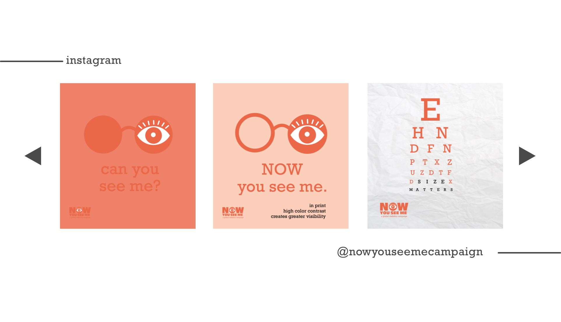
The Now You See Me campaign is an initiative to take on the challenge of visual designs with low readability associated with typography and color contrasts. It’s our goal to create a new set of design standards and guidelines to make everything we see around us more visible.
a global visibility campaign
explaining the issue
Readability is defined as the ease with which a reader can understand a written text. Low color contrast and small type (LCCST) on print materials have the potential to cause issues on readability, comprehension, and communication among consumers, especially those with vision impairment. Often times graphic designers fail to keep these audiences and aspects in mind when creating designs due to modern design practices, aesthetics, and education. To evaluate the challenges and impact presented by LCCST materials, we asked the following research questions:
- Which population (age groups, with or without visual impairment) find challenging by LCCST materials?
- What emotional responses do consumers have toward these materials?
- What characteristics (types of LCCST) appear most challenging?
- Which industries are most responsible for creating these materials? For what reasons?
research & findings
We surveyed over 200 U.S. consumers, and asked the participants rate the readability of a variety of print materials one at a time, in a scale of 1 to 5, from “Very Easy to Read” to “Extremely Difficult or Impossible to Read”. Through data analysis we found that:
- Small font size and low color contrast present readability issues among over 90% of the population;
- Font size (FS), color contrast ratio (CC), font weight (FW), font proportion (FP), and letter-spacing (LS) are the major factors affecting readability;
- The product of these five factors which we termed as Typographic Readability Index (TRI) is highly corelated with readability rating;
- An ideal TRI (≥ 50) indicates a good readability;
T.R.I.
Typographic Readability Index (T.R.I.) is a reliable measurement which can be used by designers to predict the level of readability of any body copy text on print materials.
The TRI works as follows:
TRI = FS x CC x FW x FP x LS

READABILITY
Readability is a principle of design to be taught in universities alongside other common principles such as hierarchy, color, repetition, and positive/negative space.
MAGNIFEYE
Our color wheel allows designers to be hands on when it comes to picking out a color scheme. We have a variety of wheels to cover different color palettes so that it can benefit any project.