Now You See Me
readability™ digital guide
This guide is intended to inform and assist design professionals, educators, and anyone interested in practicing, teaching, or learning typography. Our research has found that over 90% of people, of all ages, and all types of visual acuity are affected by difficulties due to low color contrast and small type in design. Through research, testing, and data analysis, we created a new quantifiable measurement of readability – T.R.I. (Typographic Readability Index). With consideration of font size, font weight, font proportion, letterspacing and color contrast ratio as its main factors, TRI can be calculated and used as a reliable predictor on how readable the text will be for the general population.
DOWNLOAD the Digital Guide Here (PDF)
readability™ mobile app
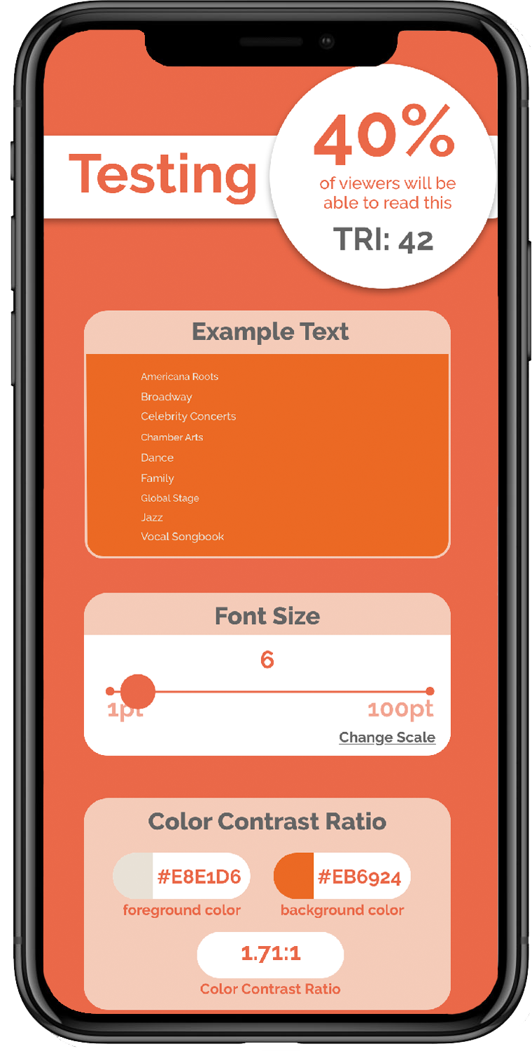
Readability® App is a handy tool to allow designers find out the TRI simply by taking a picture of their designs using a mobile phone. This app also provides a built-in TRI calculator which can be used to adjust any of the five factors for predicting readability.
The app works by holding up the in-app camera to capture any print material, it then scans the image and highlights any areas of text that has a low TRI. The user can select the text and view the percentage of viewers that would be able to read this text along with suggestions on how to make the text more readable. From there, the user can test different text and/or color settings in real-time and view the results as the percentage of readability updates. Once the optimal settings have been achieved, the user can save or share their settings to use as a guideline in their original design document.